Creating A HexBin Visualization

Data Voodoo
HexBinGenerator
Today, we’re going to develop a small program to generate a handy HexBin plot that will allow us to simply define the source file, our desired x and y attributes, gridsize, and extents.
What is a Hex Bin?
A Hex Bin is a plot formed by hexagonal tessellation of bivariate data points. For example, we could be looking at a dataset containing observations of drug treatment dosages, and enzymatic rates, both recorded as continuous data. Perhaps we could hope to identify the ideal dose by comparing our suspected effect on a target enzyme.
What Does It Do?
Unlike a simple scatter plot, which plots each observation as a single point, we are instead plotting the density of observations within a bin.
Why Is That Helpful?
Many reasons! Like everything in statistics, there are many rules where it might be useful, and where it might not be useful. One such case of the approach being advantageous, is when there are many overlapping datapoints. A swarmplot could be used to seperate the points, but we’ll talk about that another time. In the case of the Hexbin, we get a clear picture of density, distributions, and relative ranges, similar to a heat map. However, unlike a heat map, the shape of the hexagon allows us to limit the effects of edge biases found in square bins, while retaining the ability to form a continuous grid.
Getting Started
Documentation
In order to build a plot, we’ll first peek at the documentation, we find the simplest case: matplotlib.pyplot.hexbin(x, y)
where x and y are bivariate datasets.
We will build on this for our program adding in the following parameters:
gridsize - Set the number of hexagons in the x-direction, or x and y direction. The default is 100.
extents - Set X & Y bin sizes.
cmap - Set a unique color map.
Another useful parameters we aren’t using:
edgecolor- Allows us to set the color around each bin, useful for clearly separating each bin via ‘white’.
Imports
import pandas as pd
import matplotlib.pyplot as plt
Build DataFrame: Chunk, Iterate, Concatenate For Big Files!
def get_data(file):
    """
    :param file: file location/name
    :return df: dataframe of file
    """
    df = pd.read_csv(file, iterator=True, chunksize=100)
    df1 = pd.concat(df, ignore_index=True)
    return df1
Build HexBin Plot
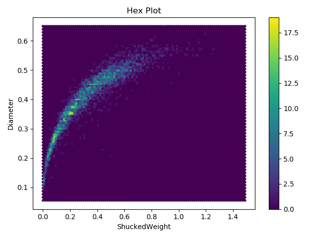
Ok, let’s go ahead and revisit our old abalone dataset that we had used to create a scatter matrix and generate the default hex plot.
def hexBinning(df, x, y):
    """
    :param df: dataframe with target data
    :param x: name of x feature
    :param y: name of y feature
    :return: generates a plot
    """
    #Build Hexbin
    plt.hexbin(df[x], df[y])
    # Title, Axes
    plt.title('Hex Plot')
    plt.xlabel(x)
    plt.ylabel(y)
    # Add color bar
    plt.colorbar()
    # Display
    plt.show()
Output Of Default Parameters
Getting Specific
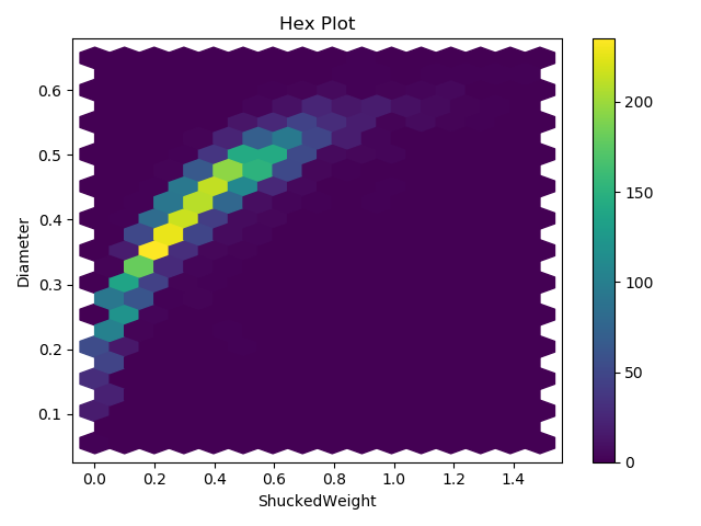
We’re going to expand our plot method to include gridsize. extents, a cmap, and edgecolors.
Add Grid Size
def hexBinning(df, x, y):
    """
    :param df: dataframe with target data
    :param x: name of x feature
    :param y: name of y feature
    :param ext: [xmin, xmax, ymin, ymax] from a list for hexbinning, similar to setting axes
    :return: generates a plot
    """
    #Build Hexbin
    plt.hexbin(df[x], df[y], gridsize=(15, 12))
    # Title, Axes
    plt.title('Hex Plot')
    plt.xlabel(x)
    plt.ylabel(y)
    # Add color bar
    plt.colorbar()
    # Display
    plt.show()
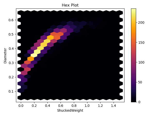
Choosing a new Color Map
def hexBinning(df, x, y):
    """
    :param df: dataframe with target data
    :param x: name of x feature
    :param y: name of y feature
    :param ext: [xmin, xmax, ymin, ymax] from a list for hexbinning, similar to setting axes
    :return: generates a plot
    """
    #Build Hexbin
    plt.hexbin(df[x], df[y], gridsize=(15, 12), cmap='inferno')
    # Title, Axes
    plt.title('Hex Plot')
    plt.xlabel(x)
    plt.ylabel(y)
    # Add color bar
    plt.colorbar()
    # Display
    plt.show()
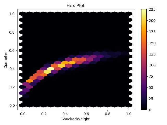
Specifying Extents
def hexBinning(df, x, y, ext):
    """
    :param df: dataframe with target data
    :param x: name of x feature
    :param y: name of y feature
    :param ext: [xmin, xmax, ymin, ymax] from a list for hexbinning, similar to setting axes
    :return: generates a plot
    """
    #Build Hexbin
    plt.hexbin(df[x], df[y], gridsize=(15, 12), cmap='inferno', extent=(ext[0], ext[1], ext[2], ext[3]))
    # Title, Axes
    plt.title('Hex Plot')
    plt.xlabel(x)
    plt.ylabel(y)
    # Add color bar
    plt.colorbar()
    # Display
    plt.show()
Run It
if __name__ == '__main__':
    #pass file location/name
    file1 = input("File")
    df = get_data((file1))
    x_col = input("X Column Name")
    y_col = input("Y Column Name")
    x_min = input("X Min")
    x_max = input("X Max")
    y_min = input("Y Min")
    y_max = input("X Max")
    axes = [x_min, x_max, y_min, y_max]
    hexBinning(df,x_col, y_col, axes)