T.Test()

Almost anything you need for aggressive data-fu, is ready to go in R.
The T-test is one of these items, and it will make you life easier.
Specifically, t.test()
Here’s a brief overview of the method in R:
t.test(x, y = NULL,
              alternative = c("two.sided", "less", "greater"),
              mu = 0, paired = FALSE, var.equal = FALSE,
              conf.level = 0.95, ...)
As you can see, it’s stunningly simple, and concise.
So, writing code to perform this test is easy.
Understanding when it’s appropriate to implement the test is where you’ll spend your time.
A basic model of situations follows,
| T-Test |
|---|
| Conditions and Assumptions: |
| N = Small, N < 30 |
| Data is continuous or ordinal |
| Randomly, representatively sampled |
| Normally distributed |
| Equal variance |
| Common Uses: |
| Hypothesis testing of equality means between two populations |
| Paired T-Test |
| One sample location test |
Example:
> DataSet1 <- rnorm(30, mean = 25)

[1] 24.24467 25.88846 22.48073 26.11464 25.89733 23.20303 25.03746 25.08877

[9] 24.50295 26.25186 24.85041 26.99215 26.81105 25.45361 24.76555 25.29305

[17] 24.21081 23.98784 23.78803 24.33964 25.37154 26.12115 25.36710 24.98885

[25] 23.87564 23.65812 25.71469 22.05810 25.12075 25.13791

> DataSet2 <- rnorm(30, mean = 75)

[1] 76.24236 73.94395 73.74170 75.36460 74.45537 74.88828 74.41090 76.18237

[9] 73.96950 76.07065 75.48238 76.05541 73.87567 74.22936 74.94673 78.29630

[17] 75.98013 74.66483 74.83209 74.93850 74.13230 75.65219 75.67551 74.45690

[25] 73.36353 76.74062 73.94887 76.70814 76.49962 75.96551

> Result <- t.test(DataSet1, DataSet2)

Welch Two Sample t-test

data:  DataSet1 and DataSet2

t = -169.13, df = 57.968, p-value < 2.2e-16

alternative hypothesis: true difference in means is not equal to 0

95 percent confidence interval:

-50.89863 -49.70793

sample estimates:

mean of x mean of y

24.88720  75.19047
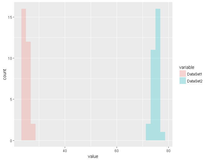
And for fun, here’s a simple plot using ggplot and reshape2 allowing us to display distributions of both sets of data side by side
First, let’s make a dataframe, df
df <- data.frame(DataSet1, DataSet2)
Then we use a method from the package “Reshape2” called melt on our newly created dataframe
meltedDataFrame <- melt(df)
Then, we can simply plot via ggplot
ggplot(meltedDataFrame,aes(x=value, fill=variable)) + geom_histogram(alpha=0.30)
The resulting image is below.
As you can see, you can save yourself a lot of time and effort with just a few lines of code.