Tipping Analysis

Gratuity Optional?
Today we’re going to look into a record from a restaurant, summarizing the tips left by customers of varying sexes on different days.
Import
Let’s import our modules, Pandas for the main analytical approaches, MatPlotLib for plotting, and NumPy for situational math. The keyword as will allow us to reference the modules by a shorthand rather than calling the full name.
import pandas as pd
import matplotlib.pyplot as plt
import numpy as np
Load Data
Next, let’s load our CSV file into a Pandas DataFrame for easy manipulation through the method GetTipFile() I wrote to easily
load our file. It accepts a filepath, is read into raw_data through the read_csv method native to Pandas. This is then loaded into a DataFrame, and ultimately returned.
def getTipFile(fileName):
    raw_data = pd.read_csv(fileName)
    df = pd.DataFrame(raw_data)
    return df
EDA and Integrity
As always, our first check needs to be our data. We’re going to do some like exploratory data analysis and an integrity check for missing data.
Once again I’ve written some simple methods to engage in our analysis. EDA(dataframe, outputpath) accepts our DataFrame and an output path for our results to be stored for reference. It will contain the first 5 rows of data, summary statistics, and information which will let us know if there is missing or null observational elements in our records. We will pass these results to another method print_EDA() to handle the output to a text file on our local drive.
#Explore Data
def EDA(dataframe, outputpath):
    head = str(dataframe.head())
    desc = str(dataframe.describe())
    missing = str(dataframe.info())
    lineBreak = "---------------------------------------"
    text_data = (lineBreak, head, lineBreak, desc, lineBreak, missing, lineBreak)
    for each in text_data:
        print(each+'\n')
    print_EDA(outputpath, head, desc, dataframe, lineBreak)

#Print to File
def print_EDA(output, head, desc, df, lb):
    with open(output, "w") as file:
        file.write(lb+"\n")
        file.write(head+"\n"+lb +"\n")
        file.write(desc + "\n"+lb+"\n")
        f = open('dataframe.info()', 'w+')
        df.info(buf=file)
        f.close()
Ok, now let’s run it.
#Set Input and Output file name + locations
input_file = "tips.csv"
output_file = "tips_report.txt"

#Extract DataFrame
df1 = getTipFile(input_file)
#EDA
EDA(df1, output_file)
Ok, this works. No missing data, 244 rows, 7 columns containing total_bill, tip, sex, smoker, day, time, size
However, there is a problem.
This is an opportunity to talk about the importance of documentation and taking comprehensive notes
about critical elements of a research project or technical program. The original source of our data neglected to define our columns; notably what size refers to. Is it the size of the table, size of the meal? We don’t know, but we would if I had been involved in the data collection planning and process.
The original business itself and the dates of transactions are also left to the imagination.
We’re left with a snapshot of a business’s information, but it is interesting nonetheless.
Pivot Table Plotting
We’re going to use a pivot table to construct our data for presentation.
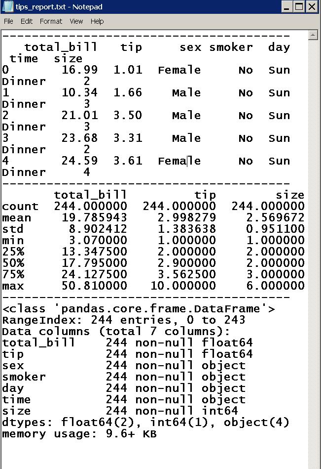
Sex and Tips
Let’s plot the tips left by our two sex categories, as a mean, minimum and maximum of observations in males versus females.
table = pd.pivot_table(df1, values='tip', index=['sex'], aggfunc= [np.mean, min, max])
table.plot(kind='bar', title = "Sex and Tips")
plt.xlabel("Sex \n (Male / Female)")
plt.ylabel("Customer Tips (USD)")
plt.grid(True)
plt.tight_layout()
plt.show()
Observations: Men Vs Women
Min: The same minimum tips left by men and women were the same, a single US Dollar.
Mean: Women: $2.75 vs Men: $3.00
Max: Women: Just shy of $7.00 vs Men: $10.00
In this sample, it looks like men tip marginally more on average, and at least a single man left a larger tip, though we don’t yet know the price of his total bill.
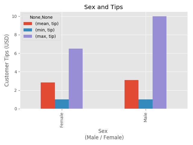
Sex, Day of the Week, and Tips
Now, let’s look at the distribution of tips left by our customers stratified by sex AND the day of the week, with the same parameters otherwise.
table = pd.pivot_table(df1, values='tip', index=['sex', 'day'], aggfunc= [np.mean, min, max])
table.plot(kind='bar', title = "Sex and Day")
plt.xlabel("Sex and Day")
plt.ylabel("Customer Tips (USD)")
plt.grid(True)
plt.tight_layout()
plt.show()
Observations: Sex Vs Day
Min: Once again, our minimum is a single USD, good to know that there is at least a dollar being left for our underpaid, and likely overworked staff. The minimum is highest when the customer is a male visitng the establishment on Saturday.
Mean: Even through our previous graph told us that men tend to tip more on average, by altering our graph we’ve uncovered some good news for the waiters and waitresses on Sunday. It turns out that this is the day with the highest average tips, and they are delivered by female patrons. Very interesting!
Max: Your eyes should immediately jump to our Maximim tip value for Men - Saturday, and we have already accounted for this in our previous plot, but we’ve learned that this high tipping individual visited the establishment on a Saturday. This would be good to know if we were the wait staff.
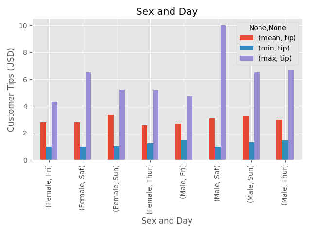
Sex, Smoker, and Tips
Ok, here’s the interesting twist on this data set, it includes whether the patron is a smoker. I’m curious how this personal information was collected, was it a smoking section designation, or did they craftily engage in some customer research?
Either way, it’s fun to have!
table = pd.pivot_table(df1, values='tip', index=['sex', 'smoker'], aggfunc= [np.mean, min, max])
table.plot(kind='bar', title = "Sex, Smokers, and Tips")
plt.xlabel("Sex and Smoker")
plt.ylabel("Customer Tips (USD)")
plt.grid(True)
plt.tight_layout()
plt.show()
Observations: Sex Vs Smoker
Min: $1USD regardless of smoker categorization
Mean: Essentially equal across groups, interesting!
Max: Aha, our big tipper is a smoker, who visits on Saturday! I feel like we’re building a psychological profile. Men appear to leave larger maximum tips regardless of smoking, but it’s also interesting that female smokers leave the larger maximum tip compared to non-smoking females.
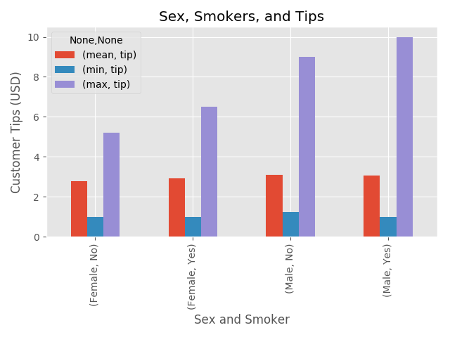
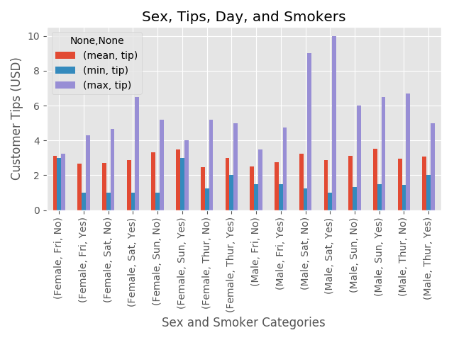
Sex, Day of the Week, Smoker and Tips
Let’s put it all together and plot everything at once, because we dissected it piece by piece, it shouldn’t be too overwhelming as we reconstruct the big picture.
table = pd.pivot_table(df1, values='tip', index=['sex', 'day', 'smoker'], aggfunc= [np.mean, min, max])
table.plot(kind='bar', title = "Sex, Tips, Day, and Smokers")
plt.xlabel("Sex and Smoker Categories")
plt.ylabel("Customer Tips (USD)")
plt.grid(True)
plt.tight_layout()
plt.show()
Observations: Sex, Smoker, Day, Tips
Min: Finally, we get some interesting results for our minimum tip. Female smokers on Sunday tend to tip very well, as do non-smoking females on Friday, both far above the minimum compared to any other day, sex, or smoking habits. Mimosas for the Sunday crowd and margaritas for the Friday group? Male smokers visiting on Tursday leave the largest minimum for the male group compared to any other day or smoking habit.
Mean: The mean is fairly consistent when all is compared, but there is a clear bump on weekends for all involved.
Max: Another Aha moment here. The big tippers like to party on Saturday. The male patrons in both categories are leaving larger maximum tips on Saturday. Our females leave the largest maximum tips on Sat and Sun. The largest is observed by smoking females on Saturday, and non-smoking women on Sunday.
Box Plot Comparison
Let’s just rehash our previous graph with another view, this time using a classic boxplot to get a sense of the distribution within each group.
Sex, Day of the Week, and Tips
df1.boxplot(column='tip', by=['sex', 'smoker', 'day'])
plt.xticks(rotation=90)
plt.show()
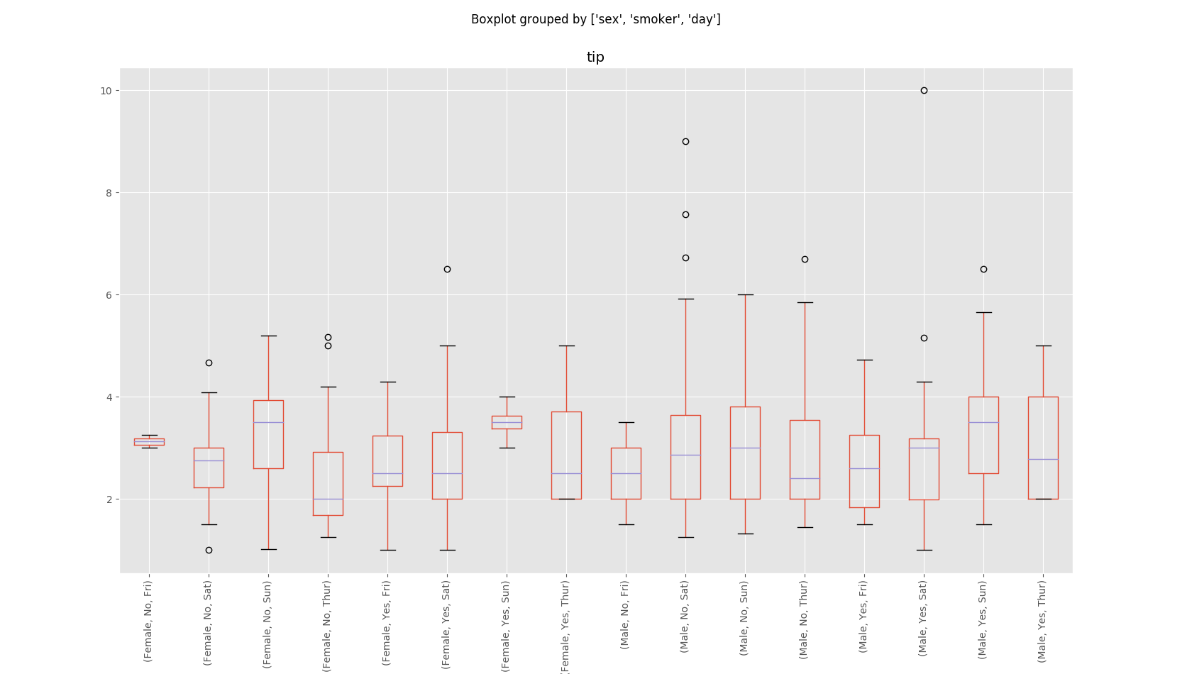
Observations: BoxPlot
Take a look at non-smoking females on Friday, and smoking females on Sunday. These are hyper condensed distributions compared to our other groups. If we were involved in the analysis of the business, we should find out if this is because there is a tiny representative sample size, or if there is something unique about these visitors because this is odd.
There’s also a new twist. When we view the data like this, we can spot our outliers, which don’t actually represent the braoder group as we first assumed! It turns out that our male, smoking, big tippers on Saturday, are actually just a single large tipper, though they do tip higher on average compared to non-smokers on a Saturday. In contrast, it turns out that men who DON’T smoke and visit on Saturday are more likely to reward their waitstaff with a larger single tip.
There are more twists to consider if you look closely, but our larger trends remain true.
Binarize Data - The Easy Way
For plotting, it’s often useful to re-code string entries into integer values in a process caled Binarization.
We’ll model this with our sex categories, male and female, which we’ll represent as the simple 0 or 1 binary paradigm. We’ll use
pd.Categorical to select a column to translate into our new binary codes.
df1['sex'] = pd.Categorical(df1.sex).codes
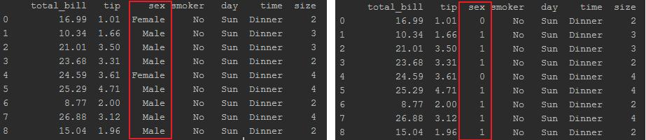
As you can see, our one line of code changed all entries previously coded as male became 1 and all entries for female became 0.