MatPlotLib: Sampling Plot Styles

Test your plot in every style.
Data visualization is a powerful communication tool. Your plot style can help you communicate results better in your next presentation or report.
Let’s build a tool that will let us test all of the popular pre-made styles across your dataset, so you can easily pick and choose what you like!
Let’s get started.
Import MatPlotLib
import matplotlib.pyplot as plt
Create a Class
class PlotChoices():
Methods
Generate List of Possible Styles
We can use plt.style.available to create a list called styles that contains the popular choices stored by the name used to set the plot. We’ll return this list and use it in the next step.
    def PlotStyles(self):
    """
    Generate amd returns a list of the top 23 styles native to MatPlotLib
    """
        styles = plt.style.available
        return styles
Generate Plots & Save Images To Folder
Now, we can take our styles list and feed it into the next step via barPlot() to create 23 bar plots built with each style type.
We will also allow a parameter called dict_data, which will let you import a dictionary based data-set to be tested with.
In addition, if you’d simply like to visualize the plot styles, I’ve included a default dictionary dataset. By entering the parameter default in place of dict_data, you can use the default dictionary.
We will also use the plt.savefig() feature to save our results into a file for simple browsing and later reference. You will need to enter an output path, make note of where it’s outputting!
def barPlots(self, dict_data, types):
"""
Function: Uses dictionary dataset to create 23 different bar plots with different
styles selected
Args: dict_data: your datase, expected to be in dictionary format
types: List of style names to use for each plot generated
Note: Define the dict_data parameter as 'default' to use a pre-set dataset
"""
if dict_data == 'default':
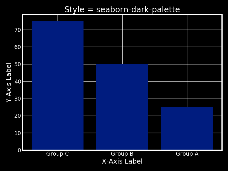
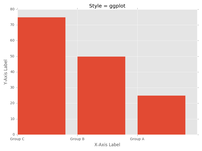
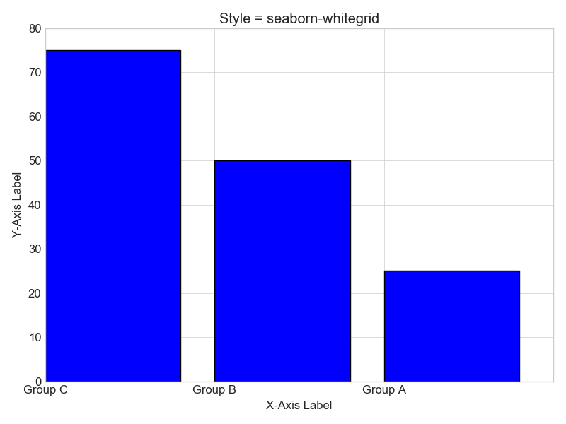
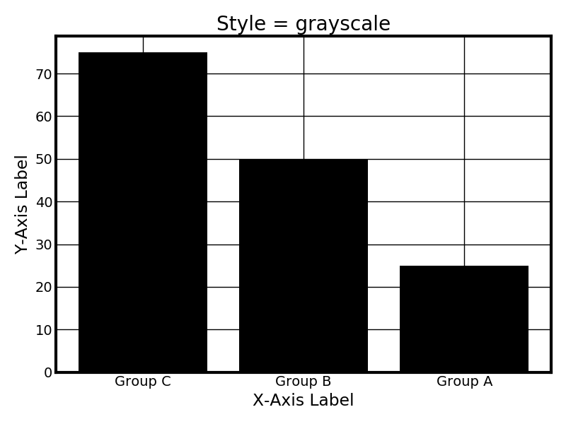
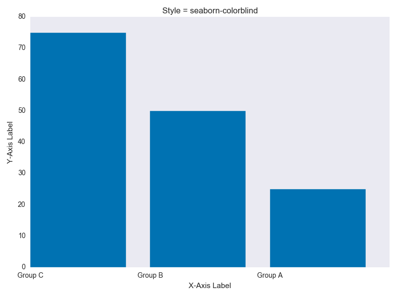
dict_data = {'Group A': 25, 'Group B': 50, 'Group C': 75}
else:
dict_data = dict_data
names = list(dict_data.keys())
values = list(dict_data.values())
plt.figure(figsize=(8, 6))
for each in types:
plt.style.use(each)
plt.bar(range(len(dict_data)), values, tick_label=names)
plt.title('Style = ' + each)
plt.xlabel('X-Axis Label')
plt.ylabel('Y-Axis Label')
plt.tight_layout()
plt.savefig('PATH_TO_YOUR_OUTPUT_FOLDER'+each+'.png')
plt.clf()
Run It
if __name__ == "__main__"
    instance = PlotChoices()
    style = instance.PlotStyles()
    instance.barPlots('default', style)
Great! Let’s check out what we’ve created.
Our Results
Classic

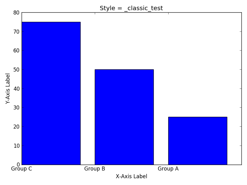
Classic_Test
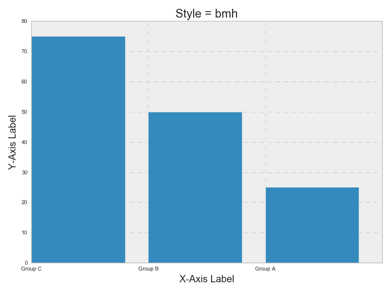
BMH
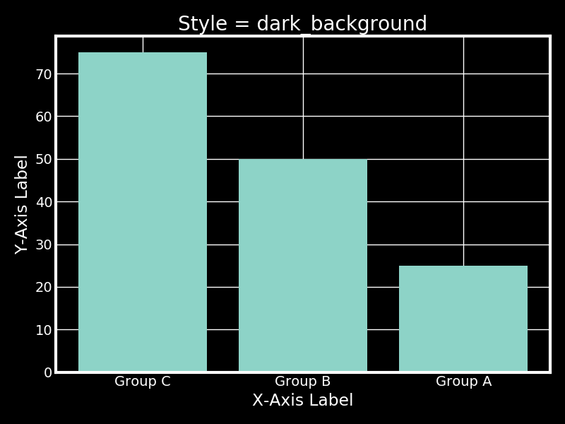
Dark Background
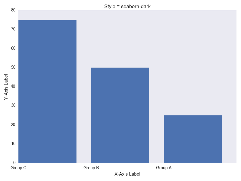
Seaborn Dark
Seaborn Dark Palette
FiveThirtyEight

GGPlot
Seaborn Deep

Seaborn Whitegrid
Seaborn Notebook

Greyscale
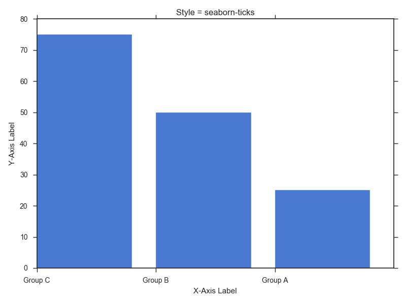
Seaborn Ticks
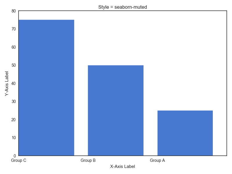
Seaborn Muted
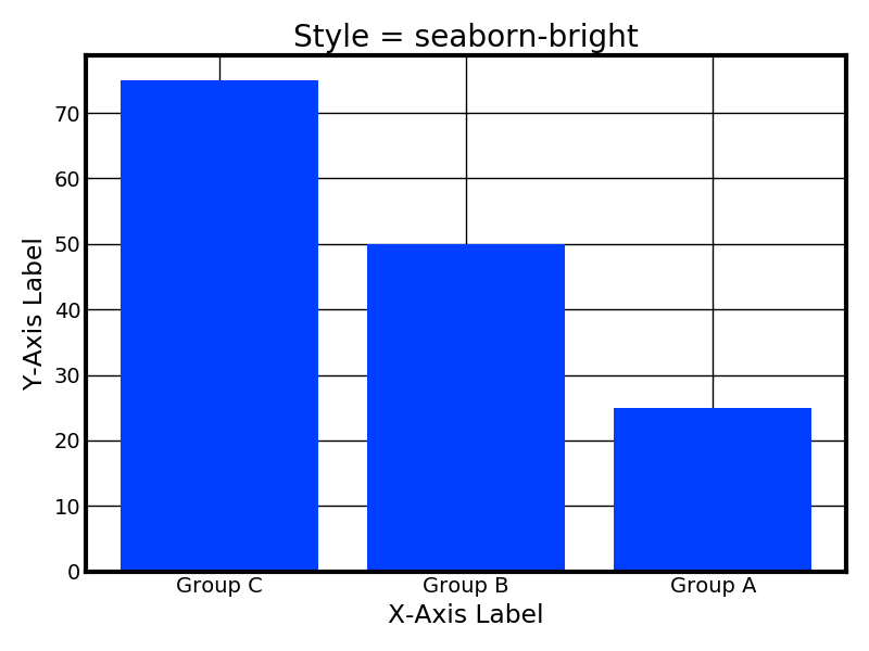
Seaborn Bright
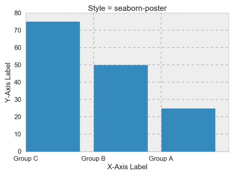
Seaborn Poster
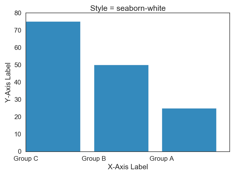
Seaborn White
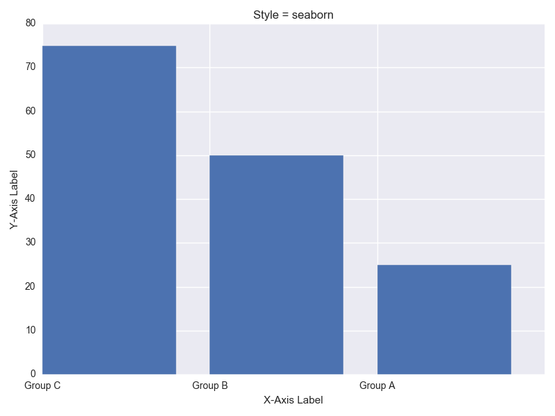
Seaborn
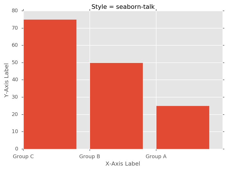
Seaborn Talk
Seaborn Darkgrid

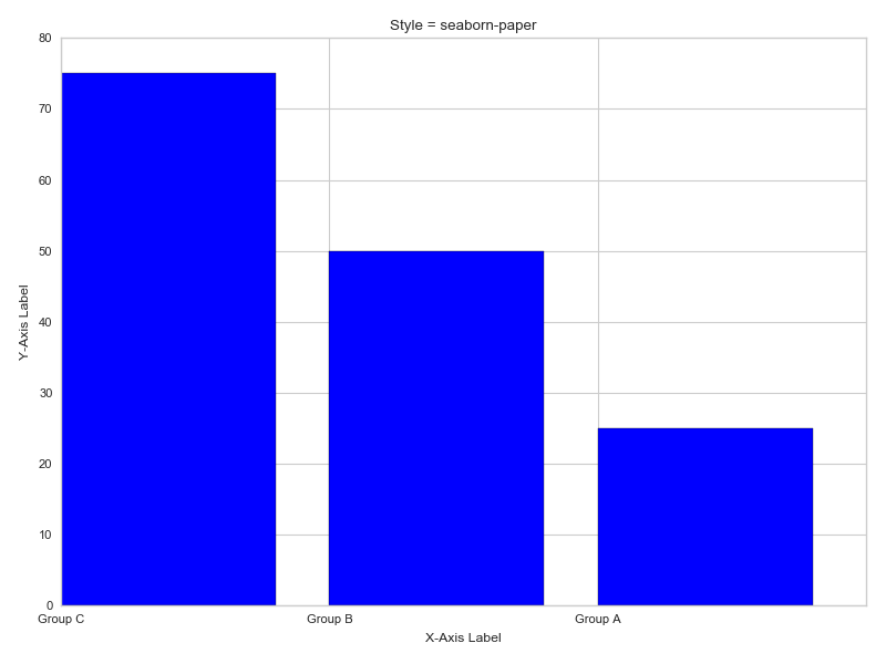
Seaborn Paper
Seaborn Colorblind
Seaborn Pastel
