Practice Problems: Statistics, Hypothesis Testing and Visualization

Novel Python solutions to end-of-chapter statistics problems from the 4th Ed. of ‘Medical Statistics’ from Campbell, Machin, and Walters.
Work In Progress!
Chapter 2 : Displaying Categorical Data
Clustered bar chart, thromboembolic women by blood type
import pandas as pd
import matplotlib.pyplot as plt

#Set File Path
file_path = '...thrombo.csv'
#Read CSV File from file_path
df = pd.read_csv(file_path)
#Set index to blood type
df = df.set_index('Blood_Group')
#Set plot style bar, title, figure size, legend, font size
df.plot(kind='bar', title ="Blood Type VS Thromboembolism",figsize=(10,5),legend=True, fontsize=12)
#rotate x-axis label, blood types
plt.xticks(rotation='horizontal')
#display plot
plt.show()
Chapter 3 : Displaying Quantitative Data
Problem I
Prompt
"""
1. Given a sample of ages (discrete years) of motor cyclists mortally injured in accidents
(i) Draw a dot plot and histogram. Is distribution symmetric or skewed?
(ii) Calculate the mean, median, mode.
(iii) Calculate Range, Inter-quartile range, and Standard deviation
"""
Imports
import matplotlib.pyplot as plt
import pandas as pd
import numpy as np
from scipy import stats
from bokeh.plotting import figure, show
from collections import Counter
Data
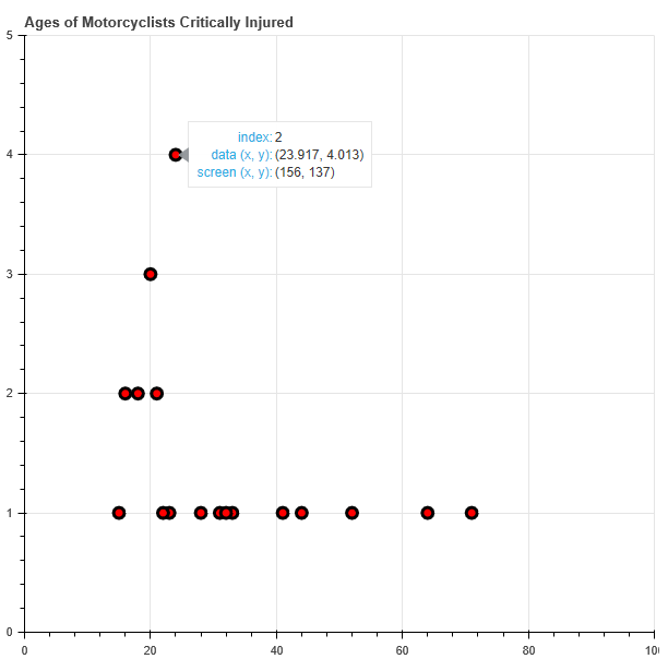
SAMPLE_DATA = [18, 41, 24, 28, 71, 52, 15, 20, 21, 31, 16, 24, 33, 44, 20, 24, 16, 64, 24, 18, 20, 21, 23, 22, 32]
"""
3.6 Exercises

1. Given a sample of ages (discrete years) of motor cyclists mortally injured in accidents
sample_data = [18, 41, 24, 28, 71, 52, 15, 20, 21, 31, 16, 24, 33, 44, 20, 24, 16, 64, 24, 18, 20, 21, 23, 22, 32]

(i) Draw a dot plot and histogram. Is distribution symmetric or skewed?
(ii) Calculate the mean, median, mode.
(iii) Calculate Range, Inter-quartile range, and Standard deviation
"""
import matplotlib.pyplot as plt
import pandas as pd
import numpy as np
from scipy import stats
from bokeh.plotting import figure, show
from collections import Counter
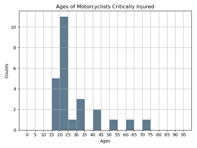
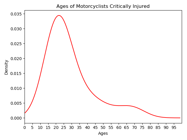
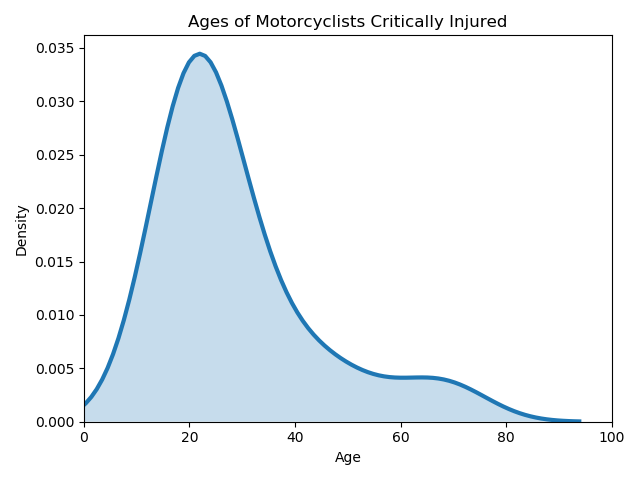
Dot Plot, Bar Chart of Ages of Motor Cyclists mortally injured in accidents
Dot Plot: Solution using Bokeh, allows user to hover over data points to display values
Bar Chart: Solution using MatPlotLib to generate binned age ranges.
KDE Charts: Kernel density plots, with/without area under the curve shaded using Seaborn vs MatPlotLib.
def exercise_i(data):
    """
    :param data: list of age of expiration due to motorcycle accident
    :param facs: list of factors, set of unique ages in data

    """

    def get_counts(data_to_count):
    """counts of incident per age"""
        counted_data = Counter(data_to_count)
        factors = list(counted_data.keys())
        counts = list(counted_data.values())
        return factors, counts

    # Get counts of incident per age
    factors, counts = get_counts(data)

    #Create Dot Plot
    dot_plot = figure(title="Ages of Motorcyclists Critically Injured", tools="hover", toolbar_location=None,
                      y_range=[0,max(counts)+1],  x_range=[0, 100])
    dot_plot.circle(y=counts,x=factors, size=10, fill_color="red", line_color="black", line_width=3)


    #Convert data to DataFrame
    df = pd.DataFrame(data)
    # Create bin, ages 0 to 100, intervals of 5
    bin_range = range(0,100,5)

    # Construct Histogram Plot, apply a grid, set bins, remove unnecessary legend
    def get_histogram(dataframe):
        dataframe.plot.hist(grid=True, bins=bin_range,
                           color='#607c8e', legend=False)
        # Add title, x and y axis labels
        plt.title("Ages of Motorcyclists Critically Injured")
        plt.xlabel("Ages")
        plt.ylabel("Counts")
        # Apply X-axis ticks, 5 year ranges
        plt.xticks(bin_range)
        plt.show()

    def get_kde_unshaded(dataframe):
        # KDE Plot, set line color to red, constrain distribution from 0 to 100
        dataframe.plot(kind='kde', color='red', legend=False).set_xlim(0,100)
        plt.title("Ages of Motorcyclists Critically Injured")
        plt.xlabel("Ages")
        plt.ylabel('Density')
        # Apply X-axis ticks, 5 year ranges
        plt.xticks(bin_range)
        plt.show()

    def get_kde_shaded(dataframe):
        ax = sns.distplot(dataframe,hist=False, kde=True,
                     kde_kws={'shade': True, 'linewidth': 3})
        ax.set_title('Ages of Motorcyclists Critically Injured')
        ax.set_ylabel('Density')
        ax.set_xlabel("Age")
        ax.set_xlim(0,100)

    get_histogram(df)
    get_kde_unshaded(df)
    get_kde_shaded(df)
    # Generate plots
    plt.show()
    show(dot_plot)


exercise_i(SAMPLE_DATA)
Bokeh Dot Plot Output (Cursor hovering data point displays value)
MatPlotLib Histogram Output
MatPlotLib KDE (Unshaded AOC)
Seaborn KDE (Shaded AOC)
Calculate Mean, Median, Mode
Mean Numpy Solution: numpy.mean(data)
Median Numpy Solution: numpy.median(data)
Mode SciPy Solution: scipy.stats.mode(int(data[0])) - access index 0 for key of mode value, convert to int to remove [] delimiter
def exercise_ii(data):
    data_mean = np.mean(data)
    data_median = np.median(data)
    data_mode = stats.mode(data)
    mode_output = int(data_mode[0])
    print("Mean:{}\nMedian:{}\nMode:{}".format(data_mean, data_median, mode_output))

 exercise_ii(SAMPLE_DATA)
Mean, Median, Mode Output

Calculate Range, Inter-quartile Range, Standard Deviation
Range NumPy Solution: numpy.abs(max(data) - min(data))
IQR SciPy Solution scipy.stats.iqr(data)
SD NumPy Solution: numpy.std(data)
def exercise_iii(data):
    data_range = np.abs(max(data) - min(data))
    data_quartiles = stats.iqr(data)
    data_sd = np.std(data)
    print("Range:{}\nInterquartile Range:{}\nStandard Deviation:{}".format(data_range, data_quartiles, data_sd))

exercise_iii(SAMPLE_DATA)
Range, Inter-quartile Range, Standard Deviation Output

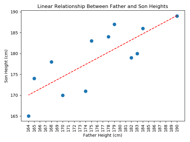
Problem II
Prompt
"""Chapter 3: Displaying Quantitative Data
3.6 Exercises

2. Given two lists of genetic father and son heights in cm
(i) Generate a scatter plot
(ii) Determine is a linear relationship appears to be present.
"""
Data
F1 = [190, 184, 183, 182, 179, 178, 175, 174, 170, 168, 165, 164]
S1 = [189, 186, 180, 179, 187, 184, 183, 171, 170, 178, 174, 165]
Solution
def problem_ii(Father, Son):
    """
    :param Father: Heights of genetic fathers in cm
    :param Son:  Heights of genetic sons in cn
    """
    fit = np.polyfit(F1, S1, 1)
    fit_fn = np.poly1d(fit)
    plt.plot(F1, S1, '.', F1, fit_fn(F1), 'r--', markersize=15)
    plt.xticks(range(min(min(F1), min(S1)), max(max(F1), max(S1), 1)+1, 1), rotation=90)
    plt.xlabel('Father Height (cm)')
    plt.ylabel('Son Height (cm)')
    plt.title('Linear Relationship Between Father and Son Heights')
    plt.show()

F1 = [190, 184, 183, 182, 179, 178, 175, 174, 170, 168, 165, 164]
S1 = [189, 186, 180, 179, 187, 184, 183, 171, 170, 178, 174, 165]
problem_ii(F1, S1)
Scatter Plot with Regression Line: Output