Machine Learning 101 - Part 1

It’s hot, it’s trendy, it’s powerful. Let’s dive in together using Python.
So, you have a set of data you want to explore. In our case, we’re going to use an example dataset from the UCI Machine Learning Repository. In particular, we’re going to explore Abalone data from:
Warwick J Nash, Tracy L Sellers, Simon R Talbot, Andrew J Cawthorn and Wes B Ford (1994)
The Population Biology of Abalone (_Haliotis_ species) in Tasmania. I. Blacklip Abalone (_H. rubra_) from the North Coast and
Islands of Bass Strait
Sea Fisheries Division, Technical Report No. 48 (ISSN 1034-3288)
What You See Is What You Get
The first thing you want to do, is find out what your dataset actually looks like.
We need to import the Pandas package for Python, which we’ll import as pd:
import Pandas as pd
Then we need to connect to the data structure, by calling:
pd.read_csv(location_of_your_target_data, names = column_names_in_your_dataset)
Set your target location:
data_url = "https://archive.ics.uci.edu/ml/machine-learning-databases/abalone/abalone.data"
We can look at the dataset directly, and find out the order and column names, which we’ll set as “columns”:
columns = ['Sex','Length','Diameter','Height','WholeWeight', 'ShuckedWeight', 'VisceraWeight', 'ShellWeight', 'Rings']
Now, we can connect to our data with the proper parameters using the earlier generic model:
data = pd.read_csv(data_url, names=columns)
Done!
Next, we should explore the data more intimately. First, let’s find out how many rows and columns we’re actually dealing with.
Find Rows and Columns
We can view the total number of Rows and Columns by using data.shape:
print(data.shape)
| output |
|---|
| (4177, 9) |
4000+ rows over 9 categories!
View Your Data
We can see what a sample of our dataset looks like by using data.head(#of rows):
print(data.head(3))
Sex  Length  Diameter  Height  WholeWeight  ShuckedWeight  VisceraWeight  \
0   M   0.455     0.365   0.095       0.5140         0.2245         0.1010
1   M   0.350     0.265   0.090       0.2255         0.0995         0.0485
2   F   0.530     0.420   0.135       0.6770         0.2565         0.1415

   ShellWeight  Rings
0         0.15     15
1         0.07      7
2         0.21      9
Assay Missing Values
We should also check for missing values, too many can cause problems, but we can massage the data by applying an average in place of NA values, if the number missing is low enough, without introducing an extreme error rate
print(data.isnull().sum())
| Category | Missing Values |
|---|---|
| Sex | 0 |
| Length | 0 |
| Diameter | 0 |
| Height | 0 |
| WholeWeight | 0 |
| ShuckedWeight | 0 |
| VisceraWeight | 0 |
| ShellWeight | 0 |
| Rings | 0 |
| dtype: | int64 |
No values are missing, this is ideal!
But What If Values ARE Missing?
In this case, you have two choices, A and B.
Choice A is simple, use only the rows which contain complete datasets, called a Complete Case Analysis. Unfortunately, depending on the number of missing elements, you sacrifice N and skew even further from good statistics and fundamental research design.
Choice B is a pathway of choices, categorized as Available Case Analysis.
I. Substitution via Imputation
1. Mean
from sklearn.preprocessing import Imputer
Imputer(missing_values=0, strategy='mean', axis=0)
You can engage in simple substition as suggested earlier, through imputation of a mean in place of the null position. Once again, you’re introducing an error factor here, but with limited missing values, your impact will be lessened.
2. Regression
If you’re studying something reasonably well documented, you could substitute values from previous research with similar metrics.
3. Sample Matching
Assuming a large N, you could engage in matching imputation. This is where you’d extract an element of consideration from another sample with similar characteristics, and use its value you’re missing in the counter-part.
There are more, but these are the relatively common approaches.
Set Bins
We can also bin our categories by Sex(or any other column if it is a categorical type) and see a count for each:
print(data.groupby('Sex').size())
| Sex | Count |
|---|---|
| F | 1307 |
| I | 1342 |
| M | 1528 |
| dtype: | int64 |
Basic Statistical Summary
You’ll probably want to get some quantification of your groups quickly! We can use .describe() to yield a simple
statistical summary of your columns. You’ll retreive the count, mean, standard deviation, minimum, maximum, and 25-75% quantiles.
print(data.describe())
            Length     Diameter       Height  WholeWeight  ShuckedWeight  \
count  4177.000000  4177.000000  4177.000000  4177.000000    4177.000000
mean      0.523992     0.407881     0.139516     0.828742       0.359367
std       0.120093     0.099240     0.041827     0.490389       0.221963
min       0.075000     0.055000     0.000000     0.002000       0.001000
25%       0.450000     0.350000     0.115000     0.441500       0.186000
50%       0.545000     0.425000     0.140000     0.799500       0.336000
75%       0.615000     0.480000     0.165000     1.153000       0.502000
max       0.815000     0.650000     1.130000     2.825500       1.488000

       VisceraWeight  ShellWeight        Rings
count    4177.000000  4177.000000  4177.000000
mean        0.180594     0.238831     9.933684
std         0.109614     0.139203     3.224169
min         0.000500     0.001500     1.000000
25%         0.093500     0.130000     8.000000
50%         0.171000     0.234000     9.000000
75%         0.253000     0.329000    11.000000
max         0.760000     1.005000    29.000000
R simplicity in Python is a beautiful thing.
Visualizing Your Data
We can also produce visualizations of our groups using matplotlib, which we’ll import as mplt
First up, we’ll produce a histogram of our column groups:
import matplotlib as mplt
#Histograms
data.hist()
mplt.show()
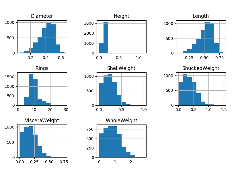
Nice to see the distributions, right?
If you’re like me, you want the biggest bang for your code buck. In that case, you’ll want to use a feature
called scatter_matrix(your_dataset)
We’ll need to invoke pandas again, and form our request as pd.scatter_matrix(your_dataset)
Hang on, because this is where things get exciting! We get to spot correlations between our columnar categories and see if our hunches have been correct.
#Correlation plots
scatter_matrix(data)
mplt.show()
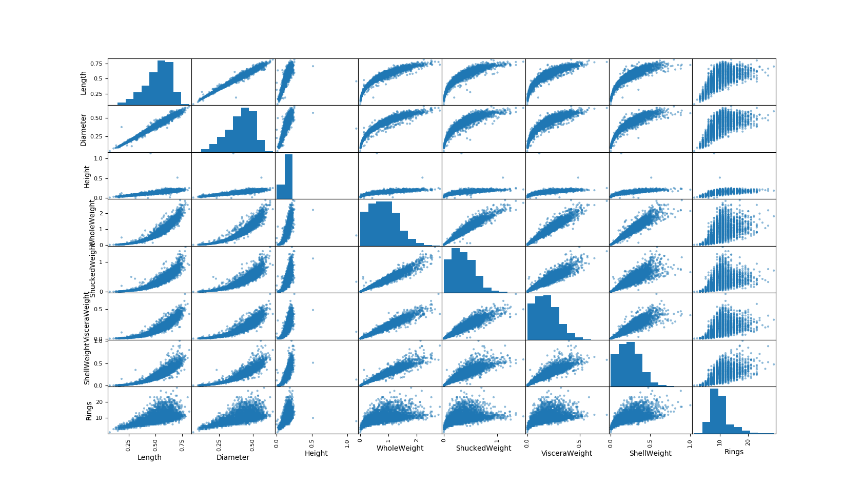
Now you can eyeball relationships you might want to pay particular attention to.
In an earlier post we discussed linearity of correlations, we can see some clear linear correlations(that nicely fit our intuition as well, such as length and diameter). You can also observe some non-linear relationships we will explore later.
The great thing is, we can pull all of these tests together in a single call, by using the summary script below
Summary of code:
import pandas as pd
import matplotlib as mplt

def surveyData(data_url, columns)
   #Access data, apply titles
   data = pd.read_csv(data_url, names=columns)
   #find rows and columns
   print(data.shape)
   #check data structure
   print(data.head(3))
   #find missing values
   print(data.isnull().sum())
   #categorize
   print(data.groupby('Sex').size())
   #statistics
   print(data.describe())
   #Histograms
   data.hist()
   mplt.show()
   #Correlation plots
   scatter_matrix(data)
   mplt.show()

#set target
data_url = "https://archive.ics.uci.edu/ml/
           machine-learning-databases/abalone/abalone.data"
#set titles
columns = ['Sex','Length','Diameter','Height','WholeWeight',
           'ShuckedWeight', 'VisceraWeight', 'ShellWeight', 'Rings']
#pass target and titles to surveyData and run the program
surveyData(data_url, columns)