ggplot() Manipulation + Python/Pandas - Part 1
You have data, how do you visualize it? GGPlot!
Based on the grammar of graphics, ggplot is a package for R that allows easy and malleable formation of data visualizations.
In this short tutorial, we’re going to look at basic functions and how to add details such as graph typeslabels, colors, and stacking multiple plots on the same graph. We’ll start with a simple set of vectors, and then utilize python to create a larger dataframe with Pandas, that we can analyze with R, or any other statistical framework.
Let’s start with the basics.
First, create a basic RxC matrix in a .csv file, or directly in R if you prefer.
SimpleGenotypes <- read.csv(“C:\Users\Andrew\Desktop\ggplot.csv”)
Ok, let’s take a peek at the data…
| AA | AB | AC | AD | BB |
|---|---|---|---|---|
| 5 | 10 | 15 | 20 | 25 |
| 6 | 11 | 16 | 21 | 26 |
| 7 | 12 | 17 | 22 | 27 |
| 8 | 13 | 18 | 23 | 28 |
| 9 | 14 | 19 | 24 | 29 |
Looks good, no missing values and it’s in a format we can use.
Now, let’s transform it into a proper dataframe using data.frame() just for practice and edification and title it ‘df’
df <- data.frame(SimpleGenotypes)
Great.
Now, we’ll use melt from the reshape2 package.
meltedGeno <- melt(df)
Again, let’s peek at what we have…
| Row | Variable | Value |
|---|---|---|
| 1 | AA | 5 |
| 2 | AA | 6 |
| 3 | AA | 7 |
| 4 | AA | 8 |
| 5 | AA | 9 |
| 6 | AB | 10 |
| 7 | AB | 11 |
| 8 | AB | 12 |
| 9 | AB | 13 |
| 10 | AB | 14 |
| 11 | AC | 15 |
| 12 | AC | 16 |
| 13 | AC | 17 |
| 14 | AC | 18 |
| 15 | AC | 19 |
| 16 | AD | 20 |
| 17 | AD | 21 |
| 18 | AD | 22 |
| 19 | AD | 23 |
| 20 | AD | 24 |
| 21 | BB | 25 |
| 22 | BB | 26 |
| 23 | BB | 27 |
| 24 | BB | 28 |
| 25 | BB | 29 |
*Note that columns “Variable” and “Value”, we’ll be using them.
Now, let’s get a visualization we can appreciate using ggplot() and geom_density()
ggplot(meltedGeno,aes(x=value, fill=variable)) + geom_density(alpha=0.55)
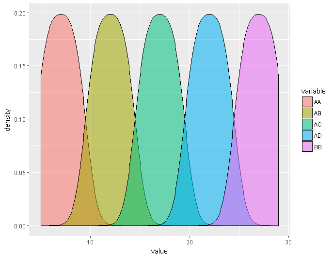
Looks good! But, we need better labels and a title if we’re going to show anyone else.
ggplot(meltedGeno,aes(x=value, fill=variable)) + geom_density(alpha=0.55) + ggtitle(“Genotypic Distributions”) + xlab(“Ranges”) + ylab(“Proportions”)
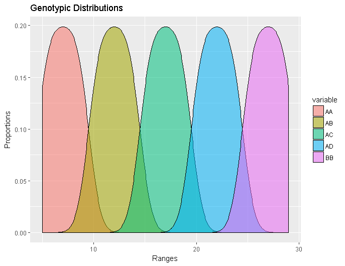
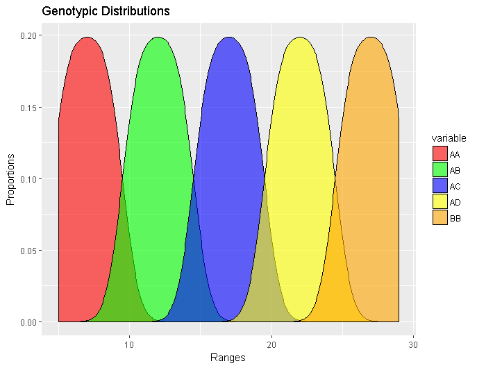
Even better! It might be too colorful for your tastes, and certainly won’t look like this in a journal entry, but for our purpose it’s fine. However if pastels REALLY aren’t your thing, you can modify the colors by altering the previous code with: scale_fill_manual( values = c(“color choice1”,”color choice 2” etc))
ggplot(meltedGeno,aes(x=value, fill=variable)) + geom_density(alpha=0.55) + ggtitle(“Genotypic Distributions”) + xlab(“Ranges”) + ylab(“Proportions”) + scale_fill_manual( values = c(“red”,”green”, “blue”, “yellow”, “orange”))
Cool? Cool.
Well, that should be enough to get you started with ggplot, we’ll continue the topic in part 2 of the topic.
| In summary: |
|---|
| 1. Install and load ggplot, reshape2 |
| 2. Load your data set |
| 3. Transorm the data set into a dataframe |
| 4. Apply melt(your_dataframe) |
| 5. Use ggplot(your_melted_dataframe), aes(x=value, fill=variable)) + geomGRAPHTYPE(conditions) + ggtitle(“chart title”) + xlab(“x-axis label”) + ylab(“y-axis label) + scale_fill_manual(c(“color1”, “color2”, “color etc”) + etc |
There are a vast array of different graphs available in ggplot, this was just a small sample of the density variety. We will work with many more in the coming posts.