Exploratory Data Analysis

Before you go data spelunking, you need to do your homework!
As a data scientist, you should approach your discipline with a strong basis rooted in hard science. One of your primary goals, is to keep an open mind. Follow the data even if it doesn’t match your intuition. Sometimes your intuition is a great asset! But, odds are, there are patterns and relationships in the data you’re not going to divine by intuition alone. You’ll need some help.
One way to do this is to engage in Exploratory Data Analysis (EDA)
Exploratory Data Analysis
EDA allows us to do exactly as I stated prior, peek into the layers of information and find relationships, regardless of your intuition or knowledge. Best of all, you can do this visually with relative ease. In a previous post ‘Machine learning 101’ we utilized the scatter_matrix(). This will be a frequently used tool in your career to spot relationships between independent and dependant variables. But there are other options as well, and you’ll want to pick one that fits your dataset.
EDA isn’t just useful for finding predictive opportunities, it’s also a fundamental step in understanding your data. We’ve already utilized the approach, for example, when parsing our data to look for missing or null values, view total entries, assay data types. You use EDA to understand your data.
According to Carnegie Mellon University, the purpose of EDA can be summarized as follows:
| EDA Uses |
|---|
| Detection of mistakes |
| Checking of assumptions |
| Preliminary selection of appropriate models |
| Determining relationships among the explanatory variables |
| Assessing the direction and rough size of relationships between independant and dependant variables |
In addition, the primary groups of EDA include:
| EDA Types |
|---|
| Univariate |
| Multivariate |
| Non-Graphical |
| Graphical |
You’ll also want to consider whether your data/question include qualitative, quantitative, categorical, and continuous features when developing your analytical approach.
For example, let’s say you were working exclusively with categorical data, which results in a binary set of choices. Yes/no, with/without, higher/lower etc. Here, you’d want to utilize something like countplot() from the Seaborn package to follow your EDA investigative thread rather than the scatter_matrix() approach.
ex. countplot(x=None, y=None, hue=None, data=None, order=None, hue_order=None, orient=None, color=None, palette=None, saturation=0.75, dodge=True, ax=None, **kwargs)
Shows the counts of observations in each categorical bin using bars. We’ll add this to a modified chunk of code from another
of my posts that returns a set of exploratory data, but with the scatter_matrix portion removed, as this set is largely composed of non-numeric data.
In this case, we’re going to use data about post-operatory patients, and in particular, we will focus on the self-reported comfort level assigned as an integer, along with the doctors decision as to where patients should be moved during their post-op recovery:
def surveyData(data_url, columns):
   #Access data, apply titles
   data = pd.read_csv(data_url, names=columns)
   #find rows and columns
   print(data.shape)
   #check data structure
   print(data.head(3))
   #find missing values
   print(data.isnull().sum())
   #categorize
   print(data.groupby('Decision').size())
   print(data.describe())
   #Seaborn countplot
   sns.set(style="darkgrid")
   sns.countplot(x="Decision", hue="COMFORT", data=data)
   mplt.show()
Then, we’ll run it via:
#Add column names
columns = ['L-CORE','L-SURF','L-O2','L-BP','SURF-STBL',
          'CORE-STBL', 'BP-STBL', 'COMFORT', 'Decision']

#Fetch and load data
data_url = "https://archive.ics.uci.edu/ml/machine-learning-databases/"
                       +"postoperative-patient-data/post-operative.data"
data = pd.read_csv(data_url, names=columns)

#pass target and titles to surveyData and run the program
surveyData(data_url, columns)
Dimensions
(90, 9)
90 rows, 9 columns
Head
   L-CORE L-SURF       L-O2  L-BP SURF-STBL CORE-STBL     BP-STBL COMFORT  \
0    mid    low  excellent   mid    stable    stable      stable      15
1    mid   high  excellent  high    stable    stable      stable      10
2   high    low  excellent  high    stable    stable  mod-stable      10

      Decision
0        A
1        S
2        A
Missing Values
L-CORE       0
L-SURF       0
L-O2         0
L-BP         0
SURF-STBL    0
CORE-STBL    0
BP-STBL      0
COMFORT      0
Decision     0
dtype: int64
There are no missing values, however, we’ll see this might be misleading when we see a plot.
Classes
Decision
A     63
A      1
I      2
S     24
dtype: int64
Hmmm, ‘A’ appears twice…curious
| Class Key: |
|---|
| I (patient sent to Intensive Care Unit) |
| S (patient prepared to go home) |
| A (patient sent to general hospital floor) |
Summary Statistics
         L-CORE L-SURF  L-O2 L-BP SURF-STBL CORE-STBL BP-STBL COMFORT Decision
count      90     90    90   90        90        90      90      90       90
unique      3      3     2    3         2         3       3       5        4
top       mid    mid  good  mid    stable    stable  stable      10        A
freq       58     48    47   57        45        83      46      65       63
So, ‘10’ is the most common post-op response, we should find out what scale they are using to make contextual sense of the value!
Plot
Our resulting graph allows us to see our categorical data, and associations with reported comfort levels of patients:
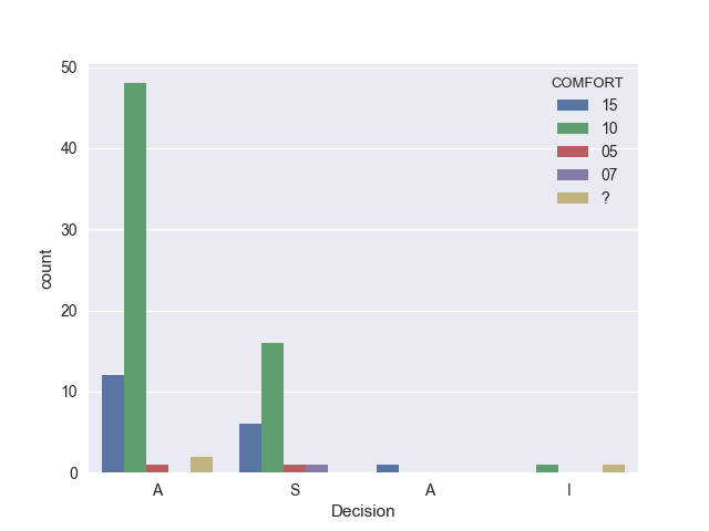
Remember when we noticed there were no missing values? It turns out someone had coded an entry as ‘?’, so while there’s not a value missing from the index, it DOES represent a missing value. In addition, it appears there may be multiple char types floating around, as we saw with the duplicate classification of the ‘A’ discharge decision.
Based on the results of this plot, self-reported comfort does not seem to be a strong predictor for the doctor’s decision. I suspect that the more appropriate predictor would be in the non-numeric groups, which reflect physiological statuses, such as core temperatures, blood pressure, O2 levels, etc.
Glad we did some EDA!
Non-Categorical
Other times, you’ll be working with continuous data, and you may just want to look for outliers or compare means, plot histograms, probabilities, box plots, and standard deviations.
Summary
For the most part, EDA is a simple procedure that yields tremendous value in both information, and in time efficiency.
So, again, DO YOUR HOMEWORK!