BitCoin Market Cap

Cryptocurrencies: A Digital Goldrush?
Part I: Market Capitalization
Market capitalization is realized through a simple formula:
Market Price of a Single Share X Number of Shares Outstanding
Digital currencies are all the rage, and may currently be imploding. We’ll have to wait and find out what happens in due time.
While we wait, we can at least gawk at the obscene amount of value they have generated in their infancy.
We’re going to survey the field of cryptocurrencies currently on market, and calculate the wealth contained within via a market capitalization analysis. To accomplish this, we’re going to utilize Python and Pandas to generate our data, and visualize it with MatPlotLib using a Jupyter Notebook.
Getting Started - Loading Data
So, let’s grab some data from the available API and see what we have. First, notice we’ve imported Pandas as pd, matplotlib.pyplot as plt, and set our style to fivethirtyeight, I’d also suggest setting it to ggplot for another snazzy(and professional) theme.
# Importing pandas
import pandas as pd

# Importing matplotlib and setting aesthetics for plotting later.
import matplotlib.pyplot as plt
%matplotlib inline
%config InlineBackend.figure_format = 'svg'
plt.style.use('fivethirtyeight')

# Reading in current data from coinmarketcap.com
current = pd.read_json("https://api.coinmarketcap.com/v1/ticker/")
Exploratory Data Analysis - EDA
As always, let’s start by taking a peek at what we have.
# Print Column Names
print(current.columns)

# Check Head
print(current.head())

# Check Tail
print(current.tail())
Our output looks like this…
Index(['24h_volume_usd', 'available_supply', 'id', 'last_updated',
       'market_cap_usd', 'max_supply', 'name', 'percent_change_1h',
       'percent_change_24h', 'percent_change_7d', 'price_btc', 'price_usd',
       'rank', 'symbol', 'total_supply'],
      dtype='object')

   24h_volume_usd  available_supply            id  last_updated  \
0      9898900000          16819812       bitcoin    1516660460
1      3594420000          97146771      ethereum    1516660452
2      2119670000       38739142811        ripple    1516660442
3       642242000          16926100  bitcoin-cash    1516660457
4       475086000       25927070538       cardano    1516660460

   market_cap_usd    max_supply          name  percent_change_1h  \
0    177126076210  2.100000e+07       Bitcoin               2.06
1     94059737996           NaN      Ethereum               3.04
2     46788749296  1.000000e+11        Ripple               2.53
3     26496116940  2.100000e+07  Bitcoin Cash               1.88
4     14143424395  4.500000e+10       Cardano               3.25

   percent_change_24h  percent_change_7d  price_btc     price_usd  rank  \
0               -7.93             -24.03   1.000000  10530.800000     1
1               -6.59             -25.29   0.092869    968.223000     2
2              -12.06             -29.91   0.000116      1.207790     3
3              -10.83             -34.82   0.150147   1565.400000     4
4              -10.06             -31.01   0.000052      0.545508     5

  symbol  total_supply
0    BTC      16819812
1    ETH      97146771
2    XRP   99993093880
3    BCH      16926100
4    ADA   31112483745


    24h_volume_usd  available_supply          id  last_updated  \
95        15913400         617314171  quantstamp    1516660463
96         3304050          10891318     bitcore    1516660454
97        11584700         104661310        tenx    1516660455
98          142157        1000000000       xplay    1516660458
99        16741300         342699966       civic    1516660457

    market_cap_usd  max_supply        name  percent_change_1h  \
95       252963618         NaN  Quantstamp               5.32
96       251393411  21000000.0     Bitcore               5.56
97       230343844         NaN        TenX               3.48
98       228942000         NaN       XPlay               3.01
99       220564097         NaN       Civic               2.04

    percent_change_24h  percent_change_7d  price_btc  price_usd  rank symbol  \
95               -7.65              -4.53   0.000039   0.409781    96    QSP
96              -13.68             -21.03   0.002214  23.082000    97    BTX
97               -7.61             -35.45   0.000211   2.200850    98    PAY
98               -8.60             -20.43   0.000022   0.228942    99    XPA
99               -9.57             -34.37   0.000062   0.643607   100    CVC

    total_supply
95     976442388
96      16763281
97     205218256
98   10000000000
99    1000000000
Let’s make note of our columns, immediately we should realize we don’t even need our simple market capitalization formula, as it’s already been calculated for us as ‘market_cap_usd’.
Let’s make a quick list of useful columns:
- id
- market_cap_usd
- percent_change_24h
- percent_change_7d
Now, we’ve only peeked at a limited set of the JSON data, so let’s look at a more comprehensive list from a stored csv that’s been translated from the JSON source.
# Read the CSV
csv_data = pd.read_csv('datasets/coinsJan2018.csv')
raw_df = pd.DataFrame(csv_data)

# Extract 'id' and 'market_cap_usd'
market_cap_raw = raw_df[['id','market_cap_usd']]

# Using .info()
print(market_cap_raw.info())

# Summary Statistics
print(market_cap_raw.describe())

# Counting the number of values
market_cap_raw.count()
<class 'pandas.core.frame.DataFrame'>

RangeIndex: 1474 entries, 0 to 1473
Data columns (total 2 columns):
id                1474 non-null object
market_cap_usd    1123 non-null float64
dtypes: float64(1), object(1)
memory usage: 17.3+ KB
None


       market_cap_usd
count    1.123000e+03
mean     4.737687e+08
std      6.510767e+09
min      1.200000e+01
25%      7.937405e+05
50%      6.616421e+06
75%      4.118481e+07
max      1.840834e+11


id                1474
market_cap_usd    1123
dtype: int64
Notice that the id and market_cap_usd values are different? We have missing data. We need to handle that.
There are multiple ways to handle the missing data, often we will choose to simply utilize .dropna(), but in this case let’s use .query().
# Filtering out rows without a market capitalization
market_cap_filtered = market_cap_raw.query('market_cap_usd > 0')

# Counting the number of values again
print(market_cap_filtered.info())
print(market_cap_filtered.count())
<class 'pandas.core.frame.DataFrame'>
Int64Index: 1123 entries, 0 to 1122
Data columns (total 2 columns):
id                1123 non-null object
market_cap_usd    1123 non-null float64
dtypes: float64(1), object(1)
memory usage: 21.9+ KB
None


id                1123
market_cap_usd    1123
dtype: int64
Great! We’ve removed the missing/non-capitalized coins from our dataset.
Now we can proceed.
Let’s get a sense of the distributions of value within the crypto field. We’re going to plot the top 10 currencies ranked by market capitalization and displayed as a bar plot. Bar plots are great in this situation because they communicate a density of information with easy audience intuition, and fit our situation as we are binning categorical data by ‘id’.
First, let’s make some decisions about what we’re doing to help frame our process. Let’s set our title, and the y-axis labels
as ‘Top 10 Currencies by Market Cap’, and ‘Percent Total (%)’
TOP_TEN_TITLE = ''Top 10 Currencies by Market Cap''
TOP_TEN_YLABEL = 'Percent Total (%)'
We can neglect naming the X-axis because we’re going to be displaying the names of each coin, so we don’t need to communicate this label to our audience for them to understand the plot and properly interpret the data, otherwise you should really give more consideration about your axes designations. Your goal is not only to communicate data, but also give your audience the variables they need to understand what they’re looking at, to craft their own analysis, and ask intelligent questions.
Let’s use slicing to return the top ten results already sorted for us, so we don’t need to utilize a sorting method now (spoiler: We will later) to yield our list.
So, we will slice indices [0:10] from our filtered list and set our index to id
top_10 = pd.DataFrame(market_cap_filtered[0:10]).set_index('id')
Now let’s do some math with our dataframe, and create a new column using .assign and named market_cap_percent, with index values representing the percentage of each coin’s market cap. The math is simply each coin’s value divided by the total market’s multiplied by 100, which we will model as:
# market_cap_perc
top_10 = top_10.assign(market_cap_perc=(top_10.market_cap_usd / market_cap_filtered.market_cap_usd.sum()) * 100)
Now we can create our plot of just the percentages representing the top-10 currencies as follows:
# Plot- Figure 1
ax = top_10.plot.bar(y='market_cap_perc', title=TOP_CAP_TITLE)
ax.set_ylabel(TOP_CAP_YLABEL)
plt.show()
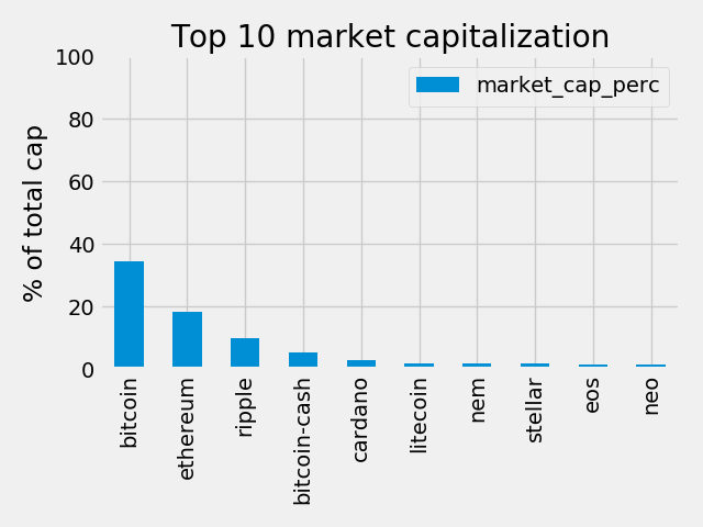
So, it looks like Bitcoin is around 35% of the total market. This is actually lower than I expected, so I’m glad I plotted this one out. I guesss the 1000+ other coins have accrued some value with the rise of BitCoin.
It’s a boring graph though.
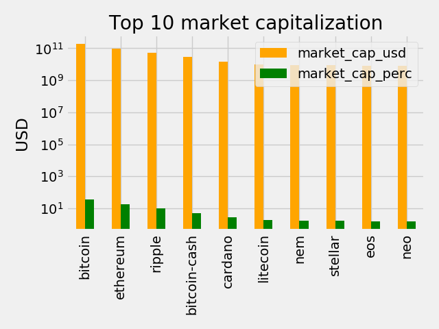
Let’s throw in a second column per bin, representing the value in USD, and set a log scale on the y-axis to deal with the large numbers($180 billion in BitCoin’s case).
#Plot- Figure 2

# Colors for the bar plot
COLORS = ['orange', 'green']

# adding the colors and scaling the y-axis
ax = top_10.plot.bar(title = TOP_CAP_TITLE, color = COLORS)
ax.set_yscale('log')

# Annotating the y axis with 'USD'
ax.set_ylabel('USD')

# Removing useless x-label
ax.set_xlabel('')
plt.show()
Part II: Measuring volatility
Now, things have been turbulent recently. Let’s get a sense of the movers and shakers. We’ll assay the movement via percent change of market value, from a 24 hour interval, and over a week’s time.
Nothing too fancy here, let’s again extract our target columns percent_change_24h and percent_change_7d.
The spoiler from earlier is appropriate now, we’re going to sort our dataframe by id and with ascending = True to separate our winners/losers by conveniently utilizing .head() and .tail()
# Selecting the id, percent_change_24h and percent_change_7d columns
volatility = raw_df[['id', 'percent_change_24h', 'percent_change_7d']]
# Setting the index to 'id' and dropping all NaN rows
volatility = volatility.dropna().set_index('id')
# Sorting the DataFrame by percentage_change_24h in ascending order
volatility = volatility.sort_values(by = 'percent_change_24h', ascending = True)
# Checking the first few rows
print(volatility.head())
print(volatility.tail())
Let’s check the output…
                        percent_change_24h  percent_change_7d
id
yellow-token                        -80.77             -52.88
aerium                              -76.69             -51.57
ethereum-movie-venture              -73.67             -10.73
debitcoin                           -65.10             -60.04
kilocoin                            -61.52             -81.44
               percent_change_24h  percent_change_7d
id
newbium                    149.02             234.05
b2bx                       176.00              97.82
bigup                      241.04             -10.49
xios                       311.48             275.85
pirate-blocks              473.79             214.81
It looks like volatility is alive in well during this correction/implosion/bursting bubble/discount opportunity. But we’re visual creatures, let’s take a look and plot our data again…
# Defining a function with 2 parameters, the series to plot and the title
def top10_subplot(volatility_series, title):
    # Making the subplot and the figure for two side by side plots
    fig, axes = plt.subplots(nrows=1, ncols=2, figsize=(10, 6))

    # Plotting with pandas the barchart for the top 10 losers
    ax1 = volatility_series[:10].plot.bar(color="red", ax=axes[0])

    # Setting the figure's main title to the text passed as parameter
    fig.suptitle(title)

    # Setting the ylabel to '% change'
    ax1.set_ylabel('% change')
    ax1.set_xlabel('')

    # Same as above, but for the top 10 winners
    ax2 = volatility_series[-10:].plot.bar(color="green", ax=axes[1])
    ax2.set_xlabel('')
    plt.tight_layout()
    plt.show()
    # Returning this for good practice, might use later
    return fig, axes
DTITLE = "24 hours top losers and winners"

# Calling the function above with the 24 hours period series and title DTITLE
fig, ax = top10_subplot(volatility['percent_change_24h'], DTITLE)

# Sorting in ascending order
volatility7d = volatility['percent_change_7d'].sort_values(ascending = True)

WTITLE = "Weekly top losers and winners"

# Calling the top10_subplot function
fig, ax = top10_subplot(volatility7d, WTITLE)
24 Hour Winners/Losers
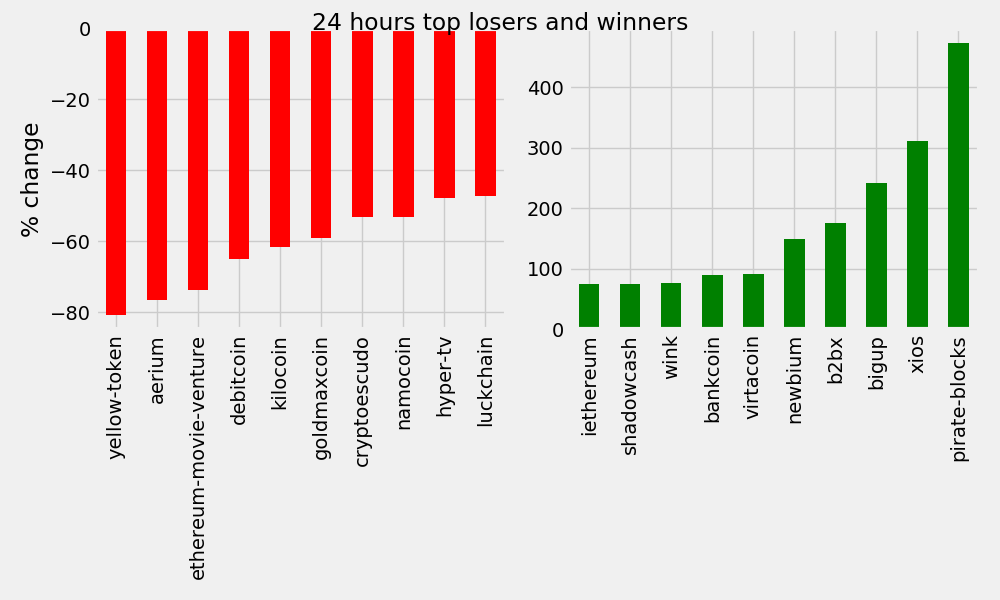
7-Day Winners/Losers
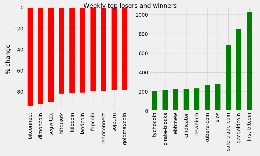
These are massive swings in either direction. However, it’s important to note that those affected are largely very low value cryptocurrencies.
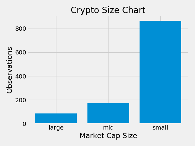
We should classify the coins based on their relative values. We’ll do this by filtering our dataframe into subsets we can categorize. We’ll define large, medium, and small cap value groups.
# Function to return cap counts, pass in an argument 'market_cap_usd larger or smaller than value'
def capcount(query_string):
    #return a query for the designated size condition, returns a count of that query
    return cap.query(query_string).count().id

# Labels for the plot
LABELS = ["large", "mid", "small"]

# Using capcount count the 'large' coins
medium = capcount('market_cap_usd > 300000000')

# get the micro counts
micro = capcount('market_cap_usd < 300000000 and market_cap_usd > 50000000')

# and the nano counts
nano =  capcount('market_cap_usd < 50000000')

# Populate a list with the 3 counts
values = [large, micro, nano]

# Plot them out with matplotlib
plt.bar(range(len(values)), values, tick_label = LABELS)
plt.title("Crypto Size Chart")
plt.ylabel("Observations")
plt.xlabel("Market Cap Size")
plt.tight_layout()
plt.show()
Classification counts of cryptocurrencies