Seattle AirBnB Analysis

Where to rent, and where to avoid, if you’ll be visiting Seattle.
We’ll begin diving into our analysis by obtaining relevant datasets. We’ll use the public information located here: https://s3.amazonaws.com/tomslee-airbnb-data-2/seattle.zip This zip file contains 22 csv files containing data recorded
by AirBnB about the Seattle area market from September 2015 through July 2017 in monthly intervals.
Rather than dealing with each month as a separate entity, we’re going to merge all 22 files into a single csv file, using Pandas concatenation, lambda filtering, and the OS package. The code below will walk you through the steps to complete this task.
Merging Multiple CSV Files into A Single File
import os
import pandas as pd
import matplotlib.pyplot as plt

#IMPORT FILES
#SET DIRECTORY TARGET
dir = 'C:/Users/Andrew/Desktop/seattle/'
#SET FILES ALGORITHM
files = filter(lambda x: x.endswith('.csv'), os.listdir(dir))

#MERGE EACH FILE WITH CONCAT
for file in files:
    raw = pd.read_csv(dir+file)
    df = pd.DataFrame(raw)
    merged = pd.concat([df])

#SAVE OUTPUT FILE
merged.to_csv('C://Users//Andrew//Desktop//seattle//merged_final.csv')
Great! We’ve compiled all of our data into a single (but long) file and preserved the original csv structure.
I manually looked at the file and noticed two columns I was personally interested in, Neighborhood and Overall_Satisfaction. The neighborhood is where the AirBnB rental is located in the city, and the Overall_Satisfaction is a
user rating of their satisfaction with the rental.
The workflow we’re going to pursue will be to extract these two columns, and create a new DataFrame for analysis
Viewing the merged file
#OPEN AND READ MERGED FILE
df = pd.read_csv('C://Users//Andrew//Desktop//seattle//merged_final.csv')
Neighborhood Ratings
According to our plan, let’s extract the two target columns and associated observations and save them as a new dataframe called df2. We’ll also want to gather a list of neighborhoods using the .unique() command, which will return us a list of all unique
neighborhood names recorded in the AirBnB dataset.
We’ll then pivot our new DataFrame so that the unique neighborhoods are displayed as columnar categories and rows populated by the users’ reported satisfaction ratings, and save this as df3.
Extracting Relevant Columns
#EXTRACT SATISFACTION RATING AND NEIGHBORHOOD
df2 = df[['overall_satisfaction', 'neighborhood']]

#MAKE LIST OF NEIGHBORHOOD NAMES
names = df2['neighborhood'].unique()

#PIVOT DATAFRAME
df3 = df2.pivot(columns='neighborhood', values='overall_satisfaction')
Cool! Let’s continue.
We’re going to create another Pandas DataFrame, but this time we’re going to manually create it using our previous data and light analysis.
This new DataFrame will consist of 3 columns, Neighborhood, Sample_Size, and Average_Rating. As you can see, Sample_Size is new, and we’re going to create it by counting the number of recorded ratings left by users of the service so we can assay an informal level of trust in the ratings. Obviously a very high or low rating would be suspicious if we’re dealing with a handful or fewer reviews, it might be disgruntled customers or AirBnB hosts leaving themselves positive scores. Personally, I think a minimum of 50 reviews would be a good cutoff for a neighborhood, but we’ll deal with that later.
We’re also going to generate an Average rating for each neighborhood, by using .mean() on each neighborhood column and returning the score.
We’ll continue by appending each category to a separate list, and then compiling the lists into a Dict data structure that we will then use to generate the actual DataFrame.
Follow along below!
Creating A New DataFrame
#Create new dataframe with N.Hood, Sample, Average Rating
name_list = []
mean_list = []
count_list = []

#Add Targets to Lists
for each in names:
    name_list.append(each)
    cur_mean = df3[each].mean()
    mean_list.append(cur_mean)
    cur_count = df3[each].count()
    count_list.append(cur_count)

#Create Dict from Lists
raw_data = {'Neighborhood' : name_list,
            'Sample_Size': count_list,
            'Average_Rating': mean_list}

#Create DataFrame from Dict, Specify Columns
df4 = pd.DataFrame(raw_data, columns = ['Neighborhood', 'Sample_Size', 'Average_Rating'])
Great! Now, how does our distribution look? I don’t want to deal with a messy graph, and neither do you. So let’s constrain our results to the Top 5 Best, and Top 5 Worst neighborhoods to rent an AirBnB, by average review.
Plotting The Top 5 Best, and Top 5 Worst Neighborhoods By Average Review
#Sort New DataFrame in Ascending Order
sort_test = df4.sort_values('Average_Rating', ascending=[0])

#Extract Top 5 and Bottom 5 Elements of Sorted DataFrame
x = sort_test.head(5)
x1 = sort_test.tail(5)

#Set Plot Style
plt.style.use('ggplot')

#Structure Plot, 1 Row and 2 Columns (Creates Side By Side Plot)
fig, axes = plt.subplots(nrows=1, ncols=2, figsize=(7, 8))

#Build Plot

#Figure 1 (Top 5 Best Rated Neighborhoods)
ax = x.plot.bar(color = "green", x= 'Neighborhood', y='Average_Rating', ax = axes[0], legend = False)
ax.set_ylim(top = 5)
ax.set_ylabel("Avg Rating (1-5)")
ax.set_xlabel("")

#Figure 2 (Bottom 5 Worst Rated Neighborhoods)
ax2 = x1.plot.bar(color = "orange", x= 'Neighborhood', y='Average_Rating', ax = axes[1], legend = False)
ax2.set_ylim(top = 5)
ax2.set_ylabel("")
ax2.set_xlabel("")

#Fit Plot and Show Plot
plt.tight_layout()
plt.show()
Neighborhood Results
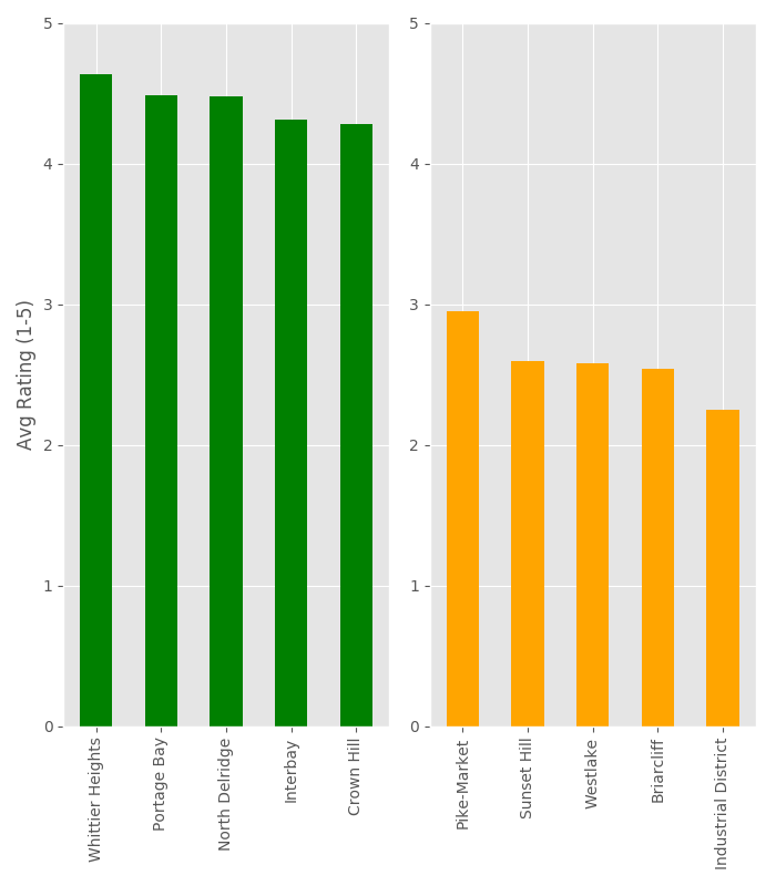
Looking at our plot, there doesn’t seem to be an overly exaggerated difference in highest to lowest aggregate neighborhoods.
This is expected, as we’re looking at an average of many rentals.
Average Price Per Neighborhood - T-Test Experiment
Let’s continue our analysis, by diving into another consideration.
What if we took the top 5 highest and lowest reviewed rental areas, and looked at the average price? Are more expensive rentals high reviewed? I think this is an interesting question, so let’s probe the data.
I already know the outline of our procedure, so let’s first import the libraries we’ll need
import pandas as pd
from scipy.stats import ttest_ind
import numpy as np
import matplotlib.pyplot as plt
Let’s get started by once again accessing the same merged dataset we created earlier.
#Open File
df = pd.read_csv('C://Users//Andrew//Desktop//bitc1//s3_files//seattle//merged_final.csv')
Now, let’s extract our relevant columns, Price and Neighborhood.
#Extract Columns
price =  df.price[:]
neighborhood = df.neighborhood[:]
#satisfaction = df.overall_satisfaction[:]
df2 = pd.DataFrame()
df2['Neighborhood'] = neighborhood
df2['Price'] = price

#Save list of neighborhood names
names = df2['Neighborhood'].unique()
We’ve created our intermediate dataframe, called df2 which contains our targets. Now, we’ll want to pivot our dataset so our
observations are sorted in a way that’s easier to access our observations by neighborhoods.
#PIVOT DATAFRAME
df3 = df2.pivot(columns='Neighborhood', values='Price')
This pivot strategy will allow us to transform an observation into multiple columnar categories.
Next, we want to slice our particular areas of interest, which we identified with our earlier analysis. We’ll grab the data associated with the top and bottom neighborhoods as follows. But first, we need to think about the situation. We’re dealing with unequal populations and a lot of potential null values due to the distribution of our rows/values and overall data structure.
We need to collect our data, and the approach I took was to combine the disparate columns into one long column. This will form the basis of our overall Group categories, Group A and Group B, reflecting the highest and lowest ranked areas.
We’ll also want to utilize our .dropna() method to throw out the missing observations.
#Extract Neighborhood A Price Data
#whittier = df3[['Whittier Heights', 'Portage Bay', 'North Delridge', 'Interbay', 'Crown Hill']]
high_reviews = pd.concat([df3['Whittier Heights'], df3['Portage Bay'], df3['North Delridge'], df3['Interbay'], df3['Crown
                         Hill']], axis=0)

#Drop Null observations
high_reviews = high_reviews.dropna(how='any',axis=0)

#Check length of good data
print(len(high_reviews))
Output: 162
There are 162 complete records
#Extract Neighborhood B Price Data
#westlake = df3[['Westlake', 'Pike-Market', 'Sunset Hill', 'Westlake', 'Briarcliff', 'Industrial District']]
low_reviews = pd.concat([df3['Westlake'], df3['Pike-Market'], df3['Sunset Hill'], df3['Westlake'], df3['Briarcliff'],
                        df3['Industrial District']], axis=0)

#Drop Null observations
low_reviews = low_reviews.dropna(how='any',axis=0)

#Check length of good data
print(len(low_reviews))
Output: 267
There are 267 complete records
So, we’ve pivoted or dataset, extracted our targets, combined them into two larger datasets, and dropped missing observations. This means we’ve defined our populations, but now we have another problem.
Our distributions have different sample sizes, Group A has 162 and Group B has 267. What can we do?
We could proceed and just take the global average per group, that would be easy and quick(and most likely quite appropriate for our situation)
Or, if this was a more complicated scenario, we could constrain our tests to random samples from each from a grouping or equal population (N) sizes.
We’ll do both!
T-Test (Independent Groups)
Unequal population:
#Extract mean of means, find mean difference in price
total_mean_high_total = np.mean(high_reviews)
total_mean_low_total = np.mean(low_reviews)
print(str(total_mean_high_total))
print(str(total_mean_low_total))
#Calculate the difference in means
print("Difference in Means from full dataset = $" + str(abs(total_mean_high_total - total_mean_low_total)))
print(ttest_ind(low_reviews, high_reviews))
Output:
135.030864198
184.0
Difference in Means from full dataset = $48.9691358025
Ttest_indResult(statistic=4.2791130085241482, pvalue=2.3182398725692023e-05)
Group A: Average Price = $135
Group B: Average Price = $184
T-Statistic: 4.279
P-Value: 0.00002318
Random Sampling Method:
t_list = []
p_list = []
higher_means = []
lower_means = []
for each in range(count):
    sample_high = high_reviews.sample(n=150)
    sample_low = low_reviews.sample(n=150)
    higher_means.append(np.mean(sample_high))
    lower_means.append(np.mean(sample_low))
    t,p= ttest_ind(sample_low, sample_high)
    t_list.append(t)
    p_list.append(p)
t_val = np.mean(t_list)
p_val = np.mean(p_list)
total_mean_high = np.mean(higher_means)
total_mean_low = np.mean(lower_means)

#Extract mean of means, find mean difference in price
print(str(total_mean_high))
print(str(total_mean_low))

#Calculate the difference in means
print("Difference in Means = $" + str(abs(total_mean_high - total_mean_low)))

#Print T and P
print("Average T and P Values over " + str(count) + " runs: ")
print("T-Value: " + str(t_val))
print("P-Value: " + str(p_val))
Output:
Group A: 134.980933333
Group B: 183.514733333
Difference in Means = $48.5338
Average T and P Values over 100 random samples of 100 runs:
T-Value: 3.74886876898
P-Value: 0.000569950860971
Conclusion
In both cases, the systemic analysis and the randomly sampled version, we arrived the same conclusion. We rejected our null hypothesis. There is a statistically significant difference in the prices of the top 5 best, and top 5 worst lowest neighborhoods.
There’s another interesting result that’s best presented by a simple graph, outlined below:
Plotting Results Pt. 2
#Plot Distributions

#DataFrame Creation
df_high = pd.DataFrame(higher_means)
df_lower = pd.DataFrame(lower_means)

#Plot fig, axes
fig, axes = plt.subplots(nrows=1, ncols=2, figsize=(7, 8))
#Apply global title
fig.suptitle("Price Distributions of Top 5 Highest and Lowest Rated AirBnB Neighborhoods")
#Define first plot
ax = df_high.plot.box(color = "green", ax = axes[0], legend = False)
ax.set_ylabel("Price \n(USD)")
ax.set_xlabel("Higher Rated")
#Define second plot
ax2 = df_lower.plot.box(color = "red", ax = axes[1], legend = False)
ax2.set_xlabel("Lower Rated")
#Set y-axes equal for each plot
ax.set_ylim(100, 215)
ax2.set_ylim(100, 215)
#Apply grids to both plots
plt.grid()
plt.grid()
#Tight and Show
plt.tight_layout()
plt.show()
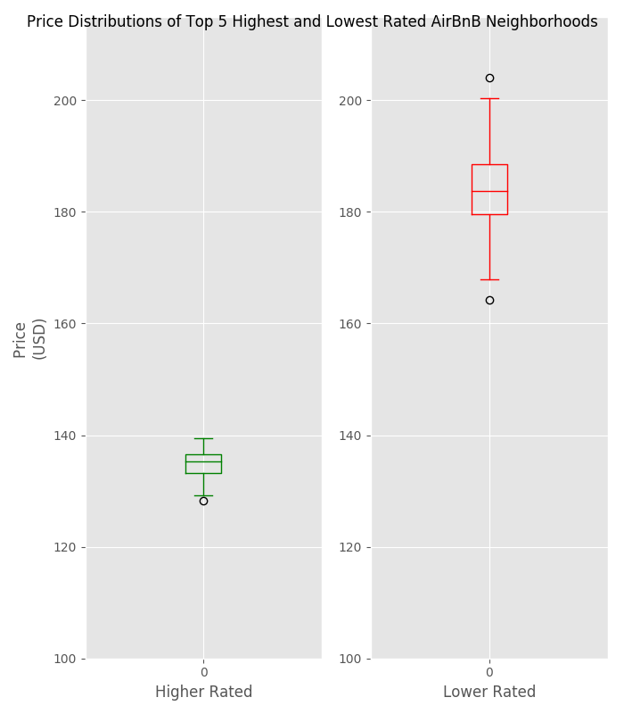
The real story here, is that the more expensive neighborhoods are also gaining lower reviews from customers.
There’s some food for thought the next time you go to set your price point.